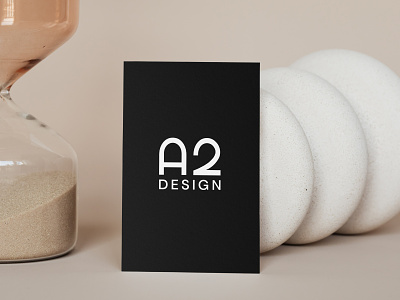
Minimal black and white architect business card design
We carried A2 Design's brand identity onto their business cards. The logo is reversed on the front for strong brand presence. We then applied the details and used white space effectively to further express the sophisticated nature of the architectural firm. The end result helps draw potential new customers for an excellent experience.
Hop To Us To View More Projects
Follow the White Rabbit 🐇 Website | Instagram | Facebook | Behance | Pinterest | YouTube
Like what you see? contact@whiterabbit.nz
More by White Rabbit View profile
Like


