Ruby Brick: brand package
Ruby Brick is a digital content agency based in Atlanta that approached us looking for a clean, modern, simple update to their brand. They weren't attached to the idea of incorporating references to rubies or brick but were open to it. As an all-female company at the time of the rebrand, they were also interested in something with a feminine touch without being too soft or delicate.
Would it be better for a content agency to have a wordmark and no logo mark? If we incorporate a logo mark, how do we give a tasteful nod to their name or industry without it being too obvious or cheesey? Would a seal logo be a better representation of a company that specializes in writing? What is the best route for delivering a feminine touch that also conveys strength and trustworthiness?
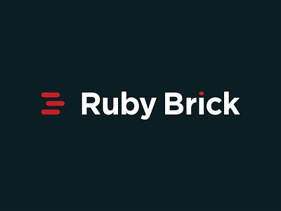
Through our discovery process with Ruby Brick and some exploration of our own, we landed on a simple, yet meaningful mark. The triple-line copy editor symbol indicating that a letter should be capitalized was pushed beyond it usual limits and used more abstractly. In one moment, the lines could be a reference to brick laying, while in another, a reference to chat bubbles or lines of text. A simple, yet effective solution to multiple questions and problems that were posed. We then paired the mark with a strong, bold typeface that could hold its own when put up against the thick round lines and bright red color of the mark. A new polished, playful, modern look replaced the old Ruby Brick logo, and set the tone for a strong brand going forward.


