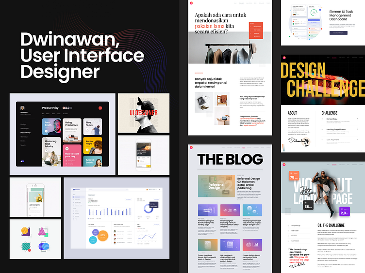
Case Study - Dwinawan.com
It is a case study about how I created a personal website - dwinawan.com from scratch. I hope you enjoy this case study. I'm happy to hear your feedback.
"Personal website is my playground. Where I can create an experimental layout and no need to worry about consistency on each page 😆✌️."
Background
When I create a personal website, I do not have a plan about the content, purpose, or who will visit the website. What I need is a playground for my creativity. I'm starting to build the personal website in Feb 2021. The first look is only my short bio and some of my design exploration.
Redesign always becomes a temptation. After 2-3 days launch my blog, I always iterate the design. Change the layout, change the colors, change everything. And finally, I have decided to use dark mode for the homepage.
Adding a blog
The next thing is to create a blog. I want a "different" look for the blog. I'm playing with shape, gradient, and some 3d effects. Here is the first version of my blog. The content is very simple, but the background is very crowded 😅
After writing more than four articles, I realized the current layout is not good. It is too scrolly. Then I have decided to use a general structure for the blog using thumbnail, title, and short description. As for the thumbnail, I give special treatment to making it unique.
A lot of great links, articles, website on Internet, but sometimes forget to bookmark them.
That's the reason I create the bookmarks page. Bookmarks are one page where I can access all links, articles, website, etc that I found on the internet.
Using the above layout means more content is more scroll. Not efficient, I need to scroll and scroll to find my specific bookmark. Then I decide to change the layout, using the category on the right to help me find bookmarks easily.
Page for Learn UI Design
I have written a lot of articles about UI Design, How to start, Design Tips, etc. I want to help other designers to learn about UI Design, and I realized that I need something more structured, step by step to learn UI Design and I can not achieve that using my blog. And finally, I create a new page called Learn UI Design.
Design Challenge
After creating a page to learn UI Design, I'm thinking about "Designers need practice, what if I added a page where designers can practice their design skill with exciting method" and that's the motivation to create Design Challenge Page.
Since I have a personal website, I have a perfect room to explore and implement any idea about layout or content
After one year, there is a lot of pages and content that I already added to my website. For me, it's an amazing journey how it started from the website with no plan and now become a website that has much content.
If you are interested to visit my website, You can access it on dwinawan.com. I'm planning to add more content.
Thanks for reading my case study. If you have any feedback, I would love to hear that. Feel free to leave your feedback in the comment section. Much thanks 😄🙏


