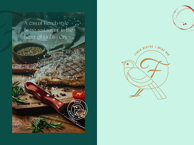
Finch — Visual Layout
I wanted to put together a new layout for Finch. I believe the tall serif font I used previously on the bistro name was distracting and perhaps took away from the simplicity of the bird. Finding the right letterform for the 'F' was also an interesting challenge — I wanted it to appear stylish yet powerful and married well with the overall look and feel.
More by Russell Meyler View profile
Like
