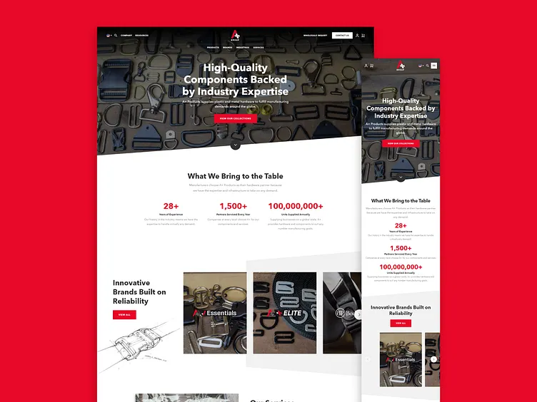
A+ Products - Homepage
A+ Products’ logo consists of a bold motif of red, black, and white that matches along with bolded text and instantly gains the attention of visitors on their homepage - this aligns well with their performance brand clientele. Another bold feature on the homepage is the experiential slider that allows users to scroll through a couple sections including their Feature Items section. This slider encourages potential customers to look through A+ Products’ offerings and in turn helps to boost A+ Products’ sales.
View Full Case Study: https://huemor.rocks/case-studies/a-products/
More by Huemor 🚀 View profile
Like
