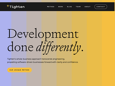
Tighten Homepage
There is so much to love about the Tighten rebrand, but I am especially partial to the brand and website UI design. The step-by-step gradation used in the visual language is carried through in the site, acting as a grid for building consistent compositions but also creating beautiful interactive moments.
Case study coming soon.
---
Looking for a brand agency? We would love to hear from you.
Email us: hello@focuslabllc.com
More by Focus Lab + Odi View profile
Like
