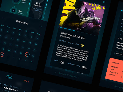
tv guide // beta screens
I've just finished the pages of my very first mobile application.
It doesn't mean though, that it's completely finished, I know, it needs some polishing yet. But it finally reached the phase, when I can ask for the opinions, feedback of fellow UX designers, UI experts, and users. So,basically, any comments are appreciated.
A couple of words about the app:
A simple tv guide application it is (or it meant to be simple).
The programs are shown, and placed like pearls on strings, which, visualize the flow of the time in a pretty unique way. The height of the "pearls" indicates the length of the programm.
Back when I started to have that urge feeling to put together a mobile app, I decided to make a tv guide, because couldn't find a single one, which is both easy-to-use, and cool-looking/modern at the same time (or at least one of these).
ps.:
the language of the screens can be tricky, because I've used Hungarian titles and descriptions here and there. sorry for that, I'll change it some time later.


