Browsers (help with a design challenge)
We've got another UX Kit in progress, and working on some browser designs.
We're looking for some feedback on an interesting design challenge, if you feel like reading on... check out the attachment.
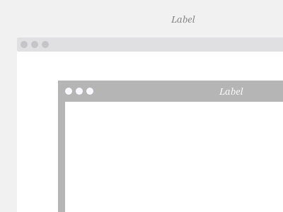
Since we always try to make our Kits as user-friendly as possible, everything is built on a 5 pixel, snapping grid, and the browser that surrounds everything is of course key to this. In OmniGraffle, when adding a stroke to a shape, you can't choose to make it "inside" or "outside", it is automatically centered. (for good reasons, after we did some research) Therefore, anything more than a 1 pixel stroke, if snapped to a grid, will overlap the content inside the browser, and cover any elements that are pushed up against the browser edge. A 1 pixel stroke also doesn't work perfectly, as it is covered by objects only on one side (just because of the nature of objects and their order on the page).
If I create an outline or custom-drawn path instead of a shape, it is distorted when stretched, and the browser height has to be easily changed, so this doesn't work either.
That leaves 2 options, the 2nd of which took a while to get to.
1. No stroke as seen in the first browser. This works fine, but if the browser background is white (it should be) it means you need a background color on the canvas, which isn't ideal... I like to keep it white for easily creating documents and our other Kits have white backgrounds.
2. Create a box with a 10px stroke. When snapped to the grid, the stroke will extend 5px on each side and perfectly surround content, even though the box is 5 px larger than the content. Only downside is a 10px thick browser is a little awkward, but it's actually kinda growing on me, and the bonus side is allows the page label to be brought into the frame nicely, if you choose to.
Have you read this far? Please weigh in... we'll take a clever idea or just a vote :)
Thanks

