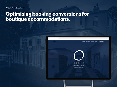
Optimising booking conversions for boutique accommodations.
Tldr; By redesigning Oscars Waterfront Hotel’s website we were able to increase overall bookings, increase guest satisfaction and reduce the amount of booking related queries to the hotel staff, freeing them up to ensure all guests have the best stay possible.
Summary
The Mission
A boutique hotel needs a website to match their unique and luxurious experience. With easy to find information about the hotel and the surrounding area, all while increasing conversion and room bookings. My mission was to help Oscars Waterfront impress their guests from the moment they digitally stepped foot on the website right through to booking their dream getaway in picturesque Port Fairy.
The Outcome
After diving into Oscars Waterfronts website, it was clear that they were in dire needed of a full redesign, focusing on optimising their copy and imagery to show off their unique accommodation and beautiful location. To achieve this, I built a whole new, responsive, website that aligned with their brand visuals and unique offerings. This allowed potential guests to find the information they needed quickly and book a beautiful room for a relaxing get away in regional Victoria.
The Impact
Since the new website has launched, Oscars Waterfront have noted a significant decrease in calls from confused guest trying to find information on their website, a decrease in bounce rates, conversion rates have also more than doubled leading to a booked-out hotel and happy guests and owners.
Services Provided
User Experience Design
User Interface Design
Content Optimisation
Visual Development
Press
Oscars Waterfront’s Social Media Accounts
Understanding their Guests
While sitting down with the owners of Oscars Waterfront we were able to put together profiles of their more common types of guests. Using these profiles, I was able to put myself in their hypothetical loafers to craft a user flow through the website that ticked off all the needs we came up with.
User Flow
Diagram in Whimsical
https://whimsical.com/oscars-flow-W5V2WRkcnirLNHmNUgKjGE
Wireframe
Once we had a workable user flow and information hierarchy, it was then onto Wireframing the key components of the website. This quick and dirty layout method allowed us to play around with the contents layout to make sure it matched our user flow and included all of the important information in their right spots to make sure we increased conversions.
High Fidelity
Once the wireframing was done and fine-tuned it was on to high fidelity imagery, this is the part I love the most, it’s where the website comes together and all the hard work we’ve done researching the client’s guest, wireframing and mapping user flows all comes together and starts to really look like a website.
Wrap up
Since launching Oscars Waterfront’s brand new website they have seen an overall increase in guest bookings, most of which are now unassisted, where previously guests were either getting confused by their old website or it was missing critical information about the accommodation and surrounding areas. Hotel staff are now able to focus on guests as they arrive and make sure that they have an amazing experience rather than running back and forth between arriving guests and missed phone calls.


