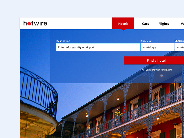
Home landing page
We're rolling out a new responsive site in the next couple of months and this is the first rough draft of what the new fare finder might look like. The purpose of this design exercise was the discoverability of the nav bar when the user first lands on the home page.
I'm open to new ideas/thoughts.
More by Ozge G. View profile
Like
