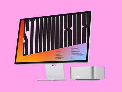
Studio 808 Website
Experimenting with applying this identity to a website homepage.
I don't love that the menu is on the left, as that breaks convention, but the letterforms in the logotype are more recognizable in this orientation.
More by Anna Xu View profile
Like
