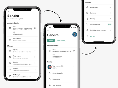
Working with IA in N26
Something that hurts product teams is the well known "feature factory" syndrome. We tend to work on new stuff rather than reducing our UX debt, which ultimately is one of the thing that keeps growing our customer support tickets for things that should be solved by the UX itself.
This project seemed easy at first, but was certainly a challenge when it came to understand the structure of our backend services and how to handle the design delivery on a way that makes sense for a BE team. For that I worked closely with our Tech Lead which was extremely useful.
My goal was removing the 3rd or even 4rd layer of navigation that we had in the app and was creating up to 5 taps to users by creating groups of content that made more sense, removing unnecessary explanations, and giving the UI some hints of color to push for our main sources of acquisition and upgrading.
Done through user interviews and mapping, the final result has a longer scroll but performed so much better when shown to users with tasks related to find specific items on this settings section. It also gave us the opportunity to integrate our social features in the page as our tech team took ownership of this section of the app.
