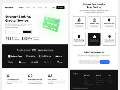
Bank Landing page
Presenting a Landing Page for Bank . I tried to make it look clean with more space and tried to use some matching dark colors for the design to make it look interesting.
Please share your feedback about color choice and placement of the elements.
Have a Project? design.elimrani@gmail.com
More by Ayoub Elimrani View profile
Like
