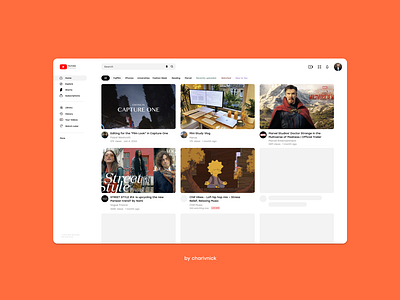
YouTube Web UI Redesign by Nick S.
Summary:
✦ new icons
✦ better fonts
✦ larger previews
✦ no dividers
✦ no useless buttons and info
I decided that my icons look better than the one there are now, also I have better spacing, larger thumbnails and again, much improved iconography. Also I removed all dividers, because they only need to appear on scroll to a side. Byeeee xoxo charivnick
More by Nick Storchai View profile
Like
