Line Art Logo Design for Agro Care
Hello Creatives!
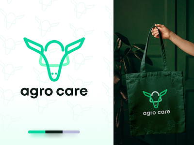
Here is the logo for a Animal feed company Agro Care. I have revamp there whole brand identity, website design because of they we needing to have a modern and organic look at there branding.
The primary logo is the symbol that represents a Cow. Among the animals there primary focus is on Cow. That's the reaosn I have tried to use the cow symbol and a line art logo.
Main focus is to make it Clean, Memorable, Easy to implemet on any box design, merchs.
✨ Colors
I have gone for the color Soft Green. Previously they were using Solid green. But thats represents grennery more, thats why we decided to go for a soft green. That is friednly yet shows the organic side.
💬 Any feedback towards this Clean & minimal line art logo design will be highly appreciated and helpful for me.
💙 Press "L" if you loved it and want to motivate me 😍
😉 Available for Freelance projects.
