Redesign Livin by Mandiri
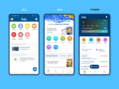
2 days ago, Livin by Mandiri has reminder their user from old version to up their apps to new version. But as an old user i prefer using the old one cause simple and that is not much an illustration and faster than new version. But maybe the new one is look like a modern style with a illustration and 3D. That is an perspective btw. no offense intended.
That's where I thought of making my own version of Livin. The point that I combined from 2 Apps before (old and new).
So this is (FUSION) the result of the combination of the previous 2 apps
1. card displays name, number, balance which can be hidden and more informative
2. add bank account (from old version) if user have 2 bank account
3. just show 4 colorful main menu in main interface with expand for look the other menu
4. quick pick from new version (using for payment, transfer, etc) to make it fast of transaction in one click
5. last transaction from old and new but placed on the front (the apps before must open in 2+ clicks), with red sign for out, green sign for in
6. Floating CTA Transfer, it can be replace with QRIS if requirement needed and thumb coverage area
7. new 3 menu to make simply, clean, and appropriate to user. Home for main interface (card, menu, quick pick, last transaction, promo, e-wallet, etc), history for transaction history with range of date, settings for setup the profile etc
8. notification on the header with Livin logo on the left
