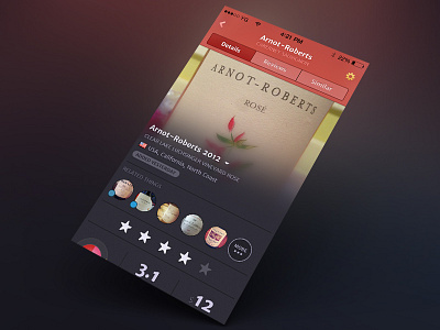
Wine iPhone App - rosé details
It’s been a while since we dribbble’d something for this project (a wine iPhone app). We started working on this in the age of skeuomorphism/iOS6 and it’s gone through many visual transitions.
We took out some more obvious layer styling; subtler drop shadows, subtler gradients and 1px dividers in the main UI (used 2px dividers before). There’s still a super subtle hint of grain in there (yes we said it!). Might look old school to some, but we believe it adds
You might notice the nav bar color is different it was in our last shot for this app’s UI. That’s because there’s a different color for each type of wine. This navbar shows for rosé wines.
Some images/elements have been changed to protect the innocent
More by Yummygum View profile
Like
