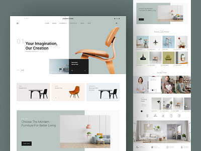
Furniture Web Design
Hello folks👋, Happy Weekend😍!
A little over a few days I had a call that would change the trajectory of creative workflow for the better🥱. I felt a few things during that call… I was excited 😍and hopeful to build a Furniture website inspiration for a Furniture and furnishings store.🔥
I started off a little nervous to make something exclusive and incredibly unique website UI design to reflect the royal furniture and trusted quality. One word remained that was the core of the entire design - “extremely aesthetic”.
During this entire UI design, each design section is designed with a minimalist design to draw attention towards the supreme quality of products. The details text section of this UI inspiration was created efficiently to share relevant information about the craftsmanship of work. With smooth navigation throughout the site, we designed this UI inspiration to entice visitors and potential leads.
With its unique placement of layouts, you can use it to share a company story or journey of the company, talk about rewards, unique products, and more🔥. Use this website UI inspiration for sharing Blogs and articles to make your site SEO-friendly and more accessible for people.
Let me know what do you think🤔 about this UI inspiration in the comment.
Have a great day! Peace✌️
📪 Email: hello@iqonic.design
👋 Instagram: iqonicdesign
🆓 Free Figma Files: iqonicdesign
🌍Website: iqonicdesign


