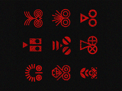
Ways of Design a non-phallic Film Projector Transversal Section


(DISCLAIMER: this study is a mention to a controversial shaped Cinemateca Brasileira logo designed by the renowed Brazilian Designer Alexandre Wollner 76 years ago)
We can't always express exactly what we want when we draw a symbol and it's practically impossible to have complete control over everyone's perception of it.
It is frequent and uncomfortable for creatives — or at least the privilege of this possible “misinterpretation” is reserved for the few.
However, wouldn't that be the big challenge, avoiding unwanted interpretations and projecting what is desirable to be read in the logo?
This is an exercise and reflection on the ways (not always successful) of representing “a cross-section of a film projector”, under this single and simple condition; almost implicit in the conception of every image, to avoid “too phallic” interpretations — which are not always projections of our unconscious…
I hope you enjoy the exercise and if you still see dicks, let them be in more interesting, creative and diverse ways lol