Wine Label Design : Walnut City Reserve

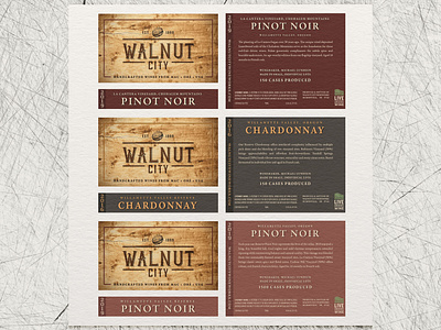

The original Reserve tier label remained unchanged over 15 vintages. We explored a number of variations and ultimately decided to move the label in an entirely new direction. The only carryover inspiration was subtle and largely symbolic–the horizontal black stripe running from edge to edge informed the two part layout of the new design. Photographic walnut burl served as the background, and the logo, predominant and centered, was beautifully debossed on 70# bright white felt facestock. With a satin varnish, the finished label was rich and warm, taking on the look of wood veneer.
The two-part front label layout made versioning quite simple. Color changes were reserved for the bottom strip and back. The content blocks were centered and arranged to be easily adaptable to varying character counts and avoid ongoing layout changes due to space and balance needs.
The new design remained true to the brand personality without being shy or understated.