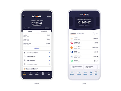
DISCOVER - Mobile App UI Refresh
The Discover banking product is great for many reasons, but the mobile app could use some UI love. I built this unsolicited concept as a fan.
The app is very slow performance wise and has some visual glitches while loading. It would be great to have a fully-loaded interface, with content skeleton placeholders while the data loads.
There is a lot of visual decoration that cold tone-down a bit and let the content be the focus. Today the fonts are very small. Fine for me, but not very accessible for many users.
The look and feel isn't that bad, but could still use a bit of modernization with better typography, animation transitions, and less design.
It's strange that you can only view three transactions without having to click "View More". Why not let me scroll to view my transactions and have access to filters right away? I find a lot of financial apps like to place promotions on the home screen and force the user to continue to dig deeper. After opening the app, it takes 3-5 taps just to view all recent transactions.
Lastly, I wish the Android widget actually worked :)
