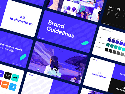
La Chouette Co — Brand Guidelines
Hello everyone 👋
Want to know more about our new identity ? 🔥
➡️ Check out our new brand guidelines :
Our story 🏔
We are a Digital product studio born in the Alps.
We believe that digital transformation should enable teams and users to achieve more, and that this is achieved by designing solutions that are focused on the users' needs, made with passion, and project managed the way it should be.
Logo 🚀
Minimalist, geometric and forward-looking, this logo, which is inspired by the symbolic animal of the Alps, reflects both the values we embody and the different professions within our company.
-
Font 🖋
We chose the Hurme typeface which is modern, impactful and flexible.
Colors 🎨
Our main color palette consists of the historical colors of La Chouette & Rwigo, which are bright turquoise for Rwigo and blue for La chouette company.
Pattern 🦉
Our pattern represents both the tag symbol used in code, but also the eyebrow of our owl on our logo.
Artwork 👩🎨
And our illustrations... what do they look like ? Check out our new identity.
Thanks to @veravoishvilo for all of these incredible illustrations ! ❤️
Visit our website
Social Media
