Retro Shrink Ray Logo Design
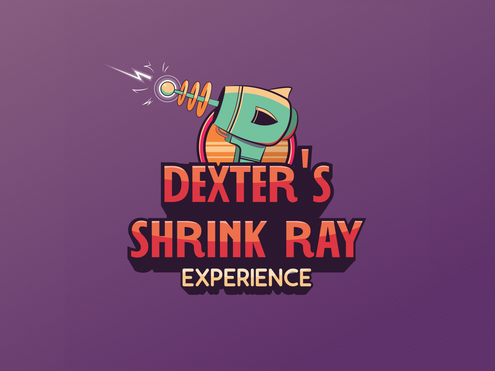
With a project that takes their consumers back to the old gaming days, the client requested a retro logo design for their new and upcoming project which included a shrink ray. The brief was to keep it close to a 3D design as they wanted to enhance the customer's experience.
I illustrated one logo with the shrink ray being an important element and gave it two different colours to suit the retro look and feel.
