Target App Icon
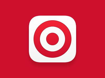
And of course, with a new app comes a new app icon. The previous version was inverted with a white bullseye on red. In this version, we wanted to signify a fresh, brand new, more friendly app.
We chose colors that we used in the app to create subtle gradients that make this icon feel at home with other great icons on users’ home screens.