Nike App design exploration
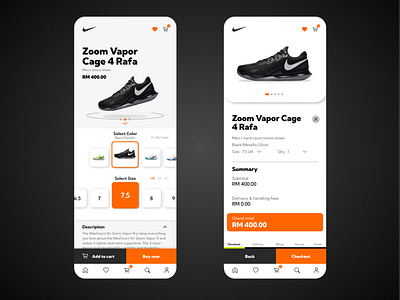
So I came across the Nike mobile app and I realize there are some gaps to be filled that could add a little spark to it. By respecting Nike's decision to keep interface plain and simple (with Black & White), I have preserved most of the aesthetics to be white (to give actual products clear legibility). By adding some hints of Nike's orange color to its CTA's and important information that might boost the app's sales lead.
