Nike Sneaker View - UI/UX Mobile App Design
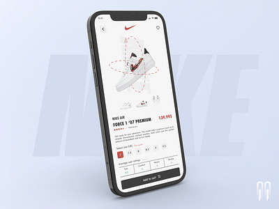


Which color version do you prefer? For me, orange reminds me more of the brand itself due to previous versions of its logo, currently the sneaker boxes, for example, are a shade closer to red. The second color brings more elegance but less "life" to the design as it is a more muted hue.
Let me know what you think about this. And don’t forget to Press 'L' if you like it ❤️
✉️ Have a project idea? I'm available for new projects contact me through my social medias or contact@dykoode.com
Social Medias
____________________
Youtube: https://www.youtube.com/channel/UCaDaVqOGhEOZdEhcPXVfGAw
Instagram: https://www.instagram.com/dykoode/
Twitter: https://twitter.com/dykoode
CodePen: https://codepen.io/dykoode
