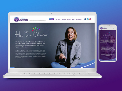
Waking Up to Autism - Responsive Website Design
Research & Concept
After the branding work that we did for Waking up to Autism, Claire came to us looking to take her new brand online and looked to us to creating her website. The important areas for the Waking Up To Autism website were the Our Story and Services sections. It was vital to capture the story behind WUTA (Waking up to Autism) as it is a really compelling story about Claire and her family. The Services section needed to include courses and workshops that people could attend to educate themselves, or be educated by Claire herself on what Autism is, and more importantly what it isn't.
Strategy & Production
We wanted to design a website that was easy to navigate and followed a very linear narrative. A clear navigation at the top of the page, as well as bright, supportive imagery, really came together to expand the Waking up to Autism branding onto the online platform.
The production phase was done in-house by our web design team and utilised Webflow for building the website responsively, but also to manage the CMS and services quickly and effectively.
Outcome & Deliverable
Once the website had launched, we had received a really large audience that immediately signed up to Claires mailing list. There was also a big acceptance for the lessons and courses that Claire offered which really opened up her brand identity and exposure to a wider audience.
Following on from this project, we created a campaign for Waking up to Autism called Smash the Confusion, which was equally well received and has catapulted Waking up to Autism as the 'go-to' provider for all things relating to Autism.
To see more from Pixel Jam - Visit Our Website

