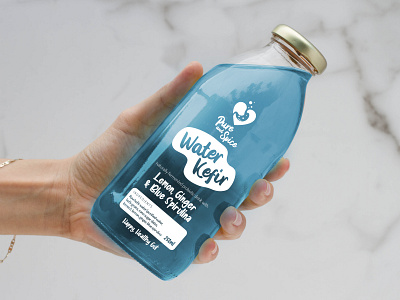
Pure and Spice - Water Kefir Package Design
Research & Concept
Bhavna started Pure and Spice in her kitchen with the passion to promoting better gut health. She came to us to help create a logo design that epitomised her vision. The basis and focus of the logo got us was the stomach and how Pure and Spice's Water kefir product creates a Happy Gut.
Strategy & Production
Once we had landed on a brand identity, we began to look at how the logo would work on a label for her Water Kefir product. We wanted to let the product shine through the glass bottles it came packaged in, so we decided to make the label transparent with white ink.
Outcome & Deliverable
The white ink really lifted off the bottle when the colour of the contents shone through. It really helped separate the product from its competitors. Not only did the product taste delicious, it really did look it too.
To see more from Pixel Jam - Visit Our Website
