Pure Recharge - Smoothie Mix Package Design
Research & Concept
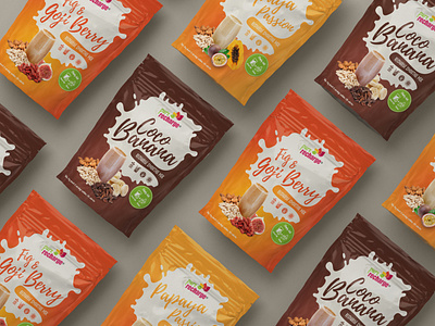
Pure recharge came to us looking for a new fresh design for their smoothie packaging. They wanted something that would be really fresh and bright in comparison to the competition and we knew we were up to the task. Key points included: 1) the ingredients had to be shown on the front of the packaging and 2) the colour of the packaging had to compliment the colour of the smoothie.
Strategy & Production
We started work on looking at competitors packaging in the market. We found that a lot of the packaging had imagery that was very dense and complex, So we wanted to make a more minimalistic packaging design that would focus on the end product and the ingredients within the packaging. One of the key elements of their branding was the use of the splat graphic. This graphical elements is used on not just the smoothie packaging but also the açai sorbet and nice cream ranges.
Outcome & Deliverable
In the end we created an identity for these smoothie mix's that takes them to the next level in terms of attractiveness and professionalism. Not only were we extremely proud of the outcome but so too was Dara from Pure Recharge.
To see more from Pixel Jam - Visit Our Website