Filters UI UX
Recently I was given a task to improve the UX of filters section in an HR application. HR would select some filters to fetch a list of matching employees working in the company.
The challenge was to design an interface that would work on iPad and would be working on MS Teams framework.
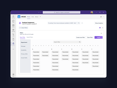
Also, there would be 250 departments, 400 Managers and 800 skills to choose from. Any conventional method for choosing the required filter would be so difficult considering the fact that it would be an iPad based application. So in order to make it easy, I followed iOS and WCA guidelines and came up with this UI.
Here the HR person can easily select the type of filter and easily sort out the exact filter either by selecting a character from the top row or by typing the entity in the search bar.
