Peure – e-commerce store
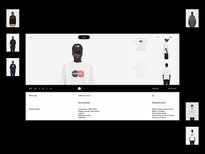
Product page of an online store Peure.
Usually product pages are using similar layout, so for this one I decided to go in a different direction. Product images are placed horizontally at the top of the screen with additional information at the bottom. Clothing size, color, price and ability to add to cart are inside black bar, which attracts attention, but doesn't take too much space.
This concept was done as part "Compositional design. Theory & Practice" course. One of the highlights of this work is that everything is done using only one font size.
2020
More by Denis Valetin View profile
Like
