Dandelions
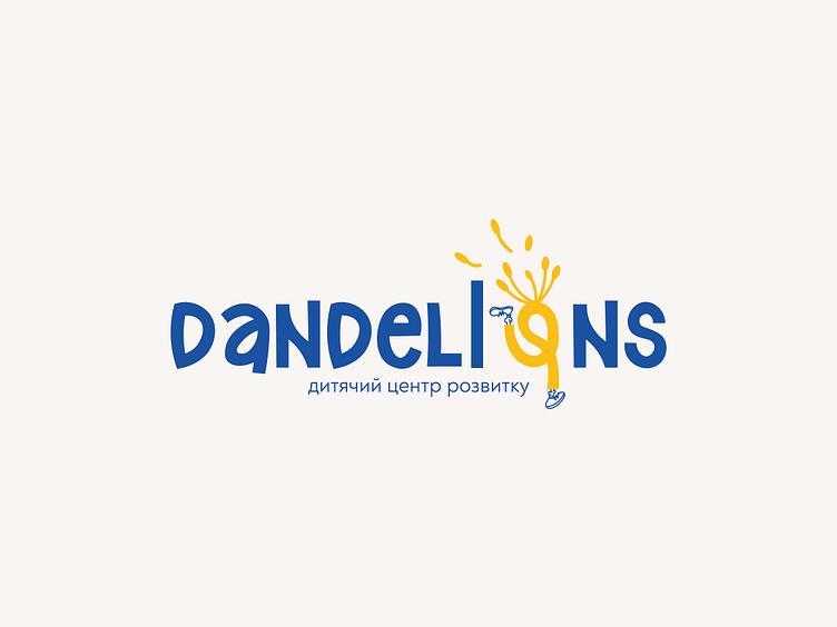
The audience is represented by various groups of people who are focused on the creative and intellectual development of their children. They are mostly parents of preschool children. That’s why it was decided to focus on younger children ,so more childish images and colors were used in the logo.The main version of the logo is designed in bright colors and in a font with smooth and not strict lines to create a lighter image. The letter "o" is an accent in our case, it contains the image of a child who "hurries to knowledge." And on top of that I added the image of a dandelion to it.
More by Rita Demyanchuk View profile
Like
