Overlays and Modals
I love designing overlays, modals, and tooltips. They are small but crucial UI elements that can either break it or make it. If you make these elements without enough context, you can easily make the user experience way worse than it was without them.
For example, I often notice that modals are used when there should be overlays, or tooltips are used instead of plain text and action. It is important to differentiate when and which design patterns you should use.
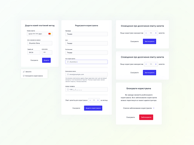
In this example, I show a couple of modals that I designed for a current project. All of them serve a single purpose – the user should focus on a specific task without being interrupted by other UI elements, including notifications. This includes such actions as adding a new payment method, blocking a user, adding a notification for the requests made by a user, etc. These actions are simple but important, so we have to help the user focus on them and complete them faster and easier. One and done :)
I've also included a quick little contextual menu. For some reasons, I really enjoy the icons I designed for this project and their proportions, even though the icons are extremely simple and pretty much are used everywhere in one way or another :)
