THIRSTY?
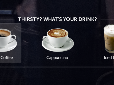
Fleshing out what the option menu will look like for the basic options during this "Choose Your Own Adventure" experience. Going for simple, photo "icons" with a no-frills selection highlight. I don't want to clutter up the UI and background photography.
More by Phil Coffman View profile
Like
