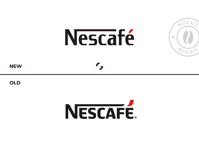
Nescafé Logo Redesign
For me, Nescafé was always a high-end coffee brand. I always see it as a brand that is serious, exotic, premium and classic. But the current logo seems too friendly and playful. So, I tried my best to give it a fresh look.
To see the full rebranding, visit Graphobian
For any sort of logo design and branding projects, contact via
Email: ikramulhadi3333@gmail.com
WhatsApp: +8801682403917
Follow me on: Facebook | Instagram
Thank you.
More by Ikramul Hadi Khan | Graphobian View profile
Like
