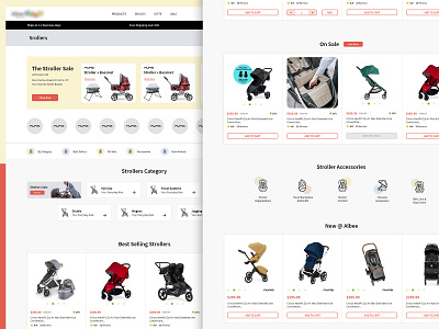
Kid's Strollers Category Design
This home page needs to be redesigned for an existing website.
To align with the brand, I have used its logo colors, which are pastel shades of red, blue, yellow, and green. These happy colors showcase the website's attraction.
Before creating this new design, I collected pain points by understanding the requirements and gathering feedback from real users who had used the existing page.
--Minimialistic one click primary action.
--upfront main elements.
--clean look and feel.
Hit L if you like it.
More by Rajni Bhaskar || Experienced UI UX Designer View profile
Like
