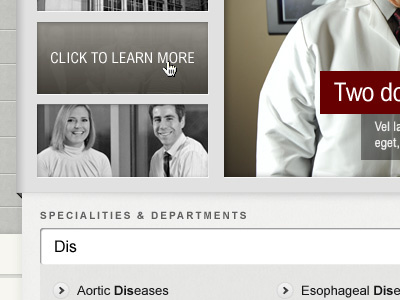
Click To Learn More
For that hospital design. Top part is the feature area, which would have a two-tiered interaction: hover to saturate the thumbnail; click to see the main area change and the "click to learn more" screen rise up and cover the thumbnail. Click a second time would take you to the story page. Seem easier than forcing users to move the mouse to the main area and click a small "Learn more" target.
Bottom area is a live search.
More by Sandor Weisz View profile
Like
