LoveMe Pilates Brand Identity Design


Brand identity design for Love Me Pilates!
Finally sharing this project that I worked on last year.
Cathryn came to me wanting an entire rebrand for her pilates studio that she has been running as a certified teacher for over ten years with a loyal client base.
She wanted a design that radiated warmth, positivity, gender neutrality and inclusivity. Over all, she wanted a simple design that would withstand the test of time and one that reflected her playful nature and joy.
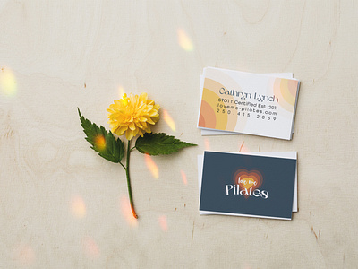
The orange/yellow heart is fading into the background to depict a beating heart. The pilates font I chose has a playfulness to it; its round that represents the movements in class. The love me font is a brush script that is organic and inviting.
This was a good project for me because it tested my design capabilities. It is not my usual colour palette of bright pinks & blues haha! I really enjoyed listening intuitively to Cathryn to understand what she wanted for her design.
