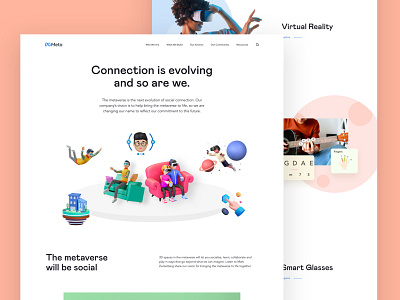
Metaverse website re-think
Just tried to give the Metaverse website a different taste.
Principle of Forgiveness- which makes your users more emotional about your product.
We all know what Forgiveness is. But what it means in UX design is - handling any actions taken by the user mistakenly or unknowingly. We humans are error-prone. We may make mistake in almost every action. According to the Murphy's law: “Anything that can go wrong will go wrong." So, making mistakes is in our DNA.
Improving UX according to the principle of Forgiveness.
What can we design apps/experiences respecting this fundamental human nature? Handling the user’s mistakes by enabling them reverse their actions, or try to make that action significantly noticeable if revering is impossible (i.e. deleting important data from database).
Cases
1. Suppose, user can forget their password, so make the opportunity to reset that with a new one.
2. In e-commerce app, user can abandon cart in the process at any moment for battery can be dead, internet can drop etc. Keep the process saved so that when the come back, he can resume the process.
3. On deleting any data permanently and which is not reversible, make the interaction significantly noticeable. Like setting the delete button color to red-filled, making the device vibrate, asking further step or option to save
for later.
4. And all cases where user’s misstep can be uncomfortable/detrimental to the user himself/herself.
The result? It will make your app more human. We all love people who forgive us our mistakes, like our family members, friends.
--
Hello, I am Mafruhur Rahman, an UX designer experience on making design systems, mobile apps, futuristic experiences.
Say me hi at mafruh.faruqi@outlook.com
or Skype at live:mafruh.faruqi
Peace! ✌️


