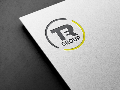
Logo Redesign TER Group
Logo Redesign TER Group
Looking for a potential redesign logo, I came across the TER Group logo.
While searching for the company, I extracted the most important information from reviewing the entire history of the company.
The main inspiration I got was that the company was composed of three parts, so I came up with the idea of merging all three letters into one whole. so by merging the letters T and R I noticed that by inserting the letter E between I get the perfect sign.
I tried to use pre-existing colors, but I used stronger shades.
My main goal was to modernize the existing logo, to give it uniqueness and timeless.
Like, comment, and feel free to give some advice.
More by Bob Tomic View profile
Like
