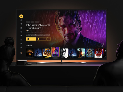
Smart-TV - App Design
Bear Plus, was commissioned to work on a new design for a new Smart TV hardware application interface.
Designing for television has become part of the umbrella UX design practices. When compared to computers and even mobile phones, designing UIs for TV is still a relatively new area. It’s a fundamentally different platform and the way users consume any content is just different.
Here are our three take-aways for UX of smart TV:
- Size and color: most of us sit more or less 3 meters away from the screen. That means, fonts, images, icons and other elements must be significantly bigger whereas colors have better contrast for readability. Bigger size does not mean you can put too much content on the screen. Maintaining the negative space for clean design is important.
- Focus state: Since Smart TV has no touch input or mouse cursor, it’s crucial to deliver a very straightforward design that makes it dead simple for navigation that relies entirely on directional pad (up, down, left, right). Users must understand clearly between focused and non-focused states.
- Predictive text: typing on remote sucks. Everybody hates that. That’s why opting for predictive text and voice dictation is a killer move here.
Press ‘L’ if you like our work
More about Bear Plus
Instagram | LinkedIn | Facebook | Behance | Awwwards
We are available for work inquiries. Reach out to us with your ideas at: hello@bear.plus


