Wine Label Design : Frau Line
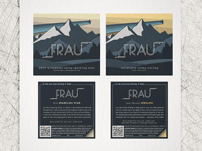


The concept for the Frau Line label was vintage national parks. We wanted something bold, charming and different. A circa 1930’s travel poster became the perfect inspiration. Lines forming gradients gave the airplane presence and a sense of motion without introducing curved elements. Shadowing was key; immediately the label went from two dimensional to diorama.
The logo, designed in unison, incorporated elements influenced by aviation, which was at the heart of this project. The inline, Deco-inspired lettering drawn to compliment the label art, gave the logo a feel of formation flying. The arrows were situated to mimic how pilots whiteboard dogfight scenarios.
