Exploring Philadelphia's Urban Landscape
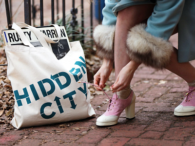
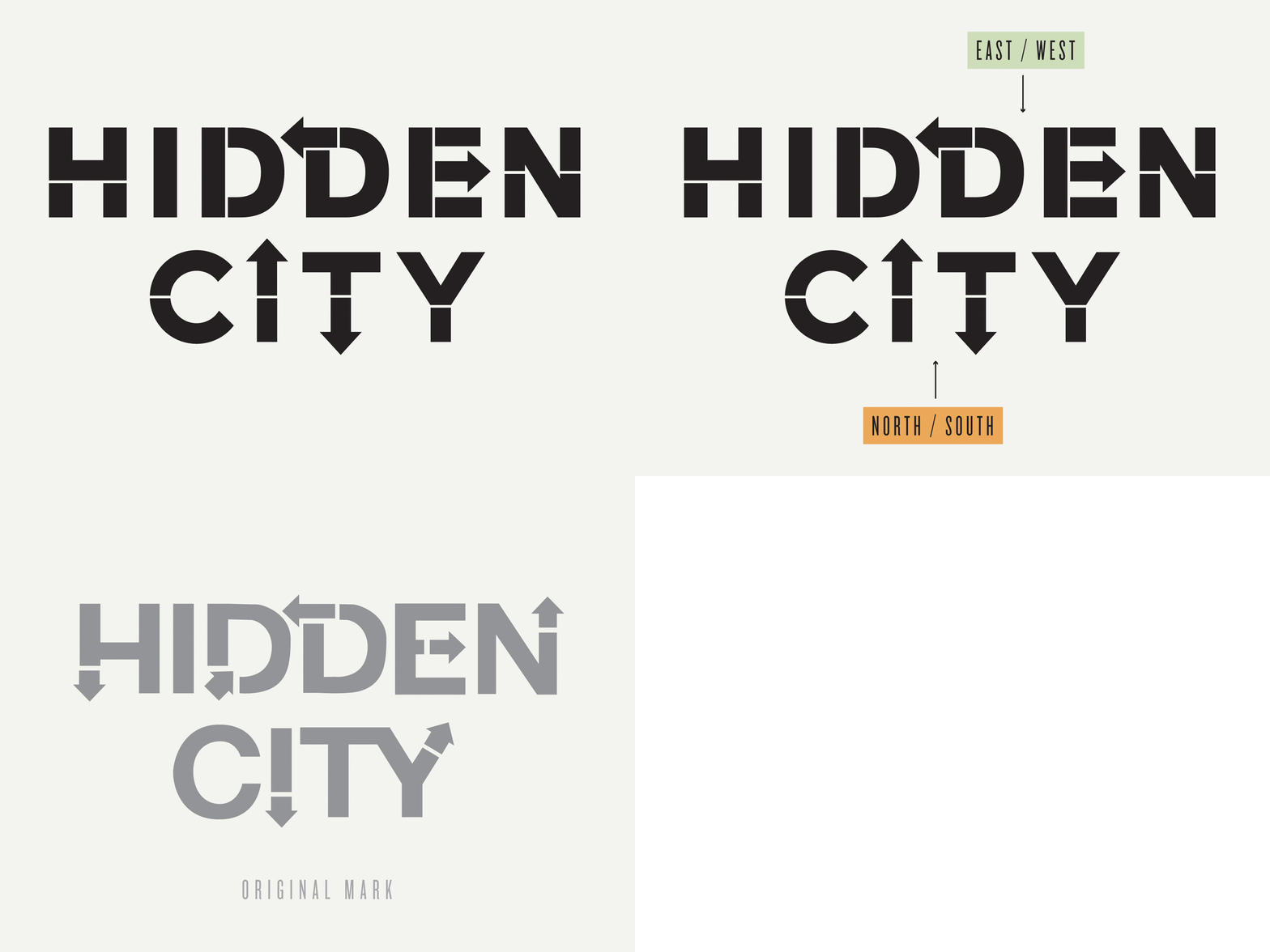
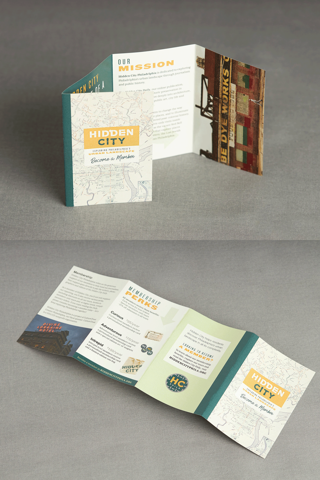
As an organization, Hidden City publishes exclusively on it’s website, so rebuilding it required a lot of deep thought and care while focusing on a mobile first design. For the brand, we opted to evolve the original mark, pairing down arrows to their most essential elements and refining the letterforms to be more geometric. Thin detail lines break the letterforms similar to that of stencils and when paired with the line “Exploring Philadelphia’s Urban Landscape” the purpose of the organization rings true. Photos by 87over80
More by Danni Sinisi View profile
Like


