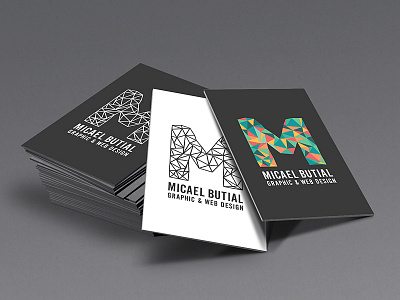
IDENTITY 2.0
My new IDENTITY! My old logo was OK, but I got tired of it. It was rounded and the color was flat. But this version 2.0 represents my style and my work.. very vibrant and geometric. I could have it on black or white background and on full color. When I scale it down, it holds it form. But this is still in working progress.. Any suggestion? I'm open :)
More by Micael Butial View profile
Like
