eBike Mobile Application
Hi buddies,
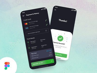
In the first screen, users can pay the bill by choosing the payment method from the following
In the second screen, the user will see the successful payment screen. After completing the bill.
In this project, I have taken the guideline of the senior designer to design an eBike app. I have learned a lot of UX aspects. I have done use cases, case studies, mind mapping & user flows. When I was stuck at some pain points, my mentor used to give me suggestions to overcome the problems.
I learned how to choose the color combination and typography under my mentor's guidelines. My mentor helped me understand the design process and gave me daily design tasks to improve my skills in UX & UI.
Special thanks to San
View full article @ Behance
More by Praveen Kumar M View profile
Like
