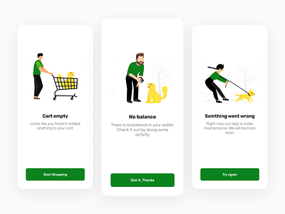
Empty status screens - Mobile Application.
Hello Dribbblers,👋🏼
Today, I'm sharing my new exploration for
Empty status screens for Mobile Application.
In the role of a designer, it is important to make users happy and satisfy all their needs. While working hard on the main pages and parts of the project, designers sometimes overlook empty states.
— — — — — — — — — —
There's a lot of room for improvement. Your feedback and appreciation is always welcome❤️. Feel free to give me some feedback.
Thank you for your like👍 and comment 💬. Press "L" if you love it. Follow me so you don't miss upcoming work.
More by Gaurav jamini View profile
Like
