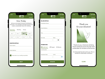
Daily UI #002
Kept the vibe minimalist with small shadows and very little beveling. Wanted to make as few spaces between the user and the "donate" click but in the future I might want to separate the billing details and payment info.
More by Kmeg Kelly View profile
Like
