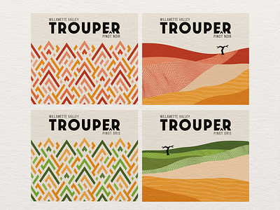
Wine Label : Trouper
The Trouper project was developed for a distributor’s keg wine program. Because of the unique application, our focus was largely on the brand name; the design was effectively going to be invisible to the consumers. We wanted something clipped, punchy, and easy to say and remember. Trouper had the right feel; perfect for a menu and the dual meaning (both entertaining and dependable) was apropos.
Two versions were presented. An Art Deco-inspired mountain pattern, and an impressionistic vineyard cross section. Grape variety, clearly identifiable through color, helped avoid confusion in a restaurant environment. Both designs were at home and lively as can be on an oversized keg label.
More by Robert Burden View profile
Like
