Recruiting Platform - UI and UX
A recruiting platform to help female developers find their place in the industry.
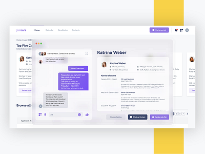
I went for a top bar navigation because it's more modern, easy to use and most common with similar hiring platforms, so it creates familiarity with users and gives them a better overview of their work process, laid out in front of them. Also, users' eye patterns tend to navigate to the top right part of the screen when they're looking to add something new to the page, and I decided to use that space to put the "Post a new job" call to action.
The "Calendar" menu would take the user to a specifically made calendar page for them to create and track interviews with potential candidates, the "Candidates" menu is specific if the users want to track every candidate who has ever applied through their platform, and the "Contacts" menu is something I came up with if recruiters are interested in hiring a candidate, but not specifically decided on it, or if they simply want to stay in touch with specific candidates for later job openings.
The rest of the dashboard includes overviews to the most active job posting, a quick overview of the daily agenda, and a reminder to the user of what their goals are for hiring quotas, especially valuable if the company is on a hiring spree.
Below this area, you can see an overview of every job posting, completely sortable and it includes information such as location, activity and an overview of the preselected top five candidates.


