Wine Logo : Frau Line
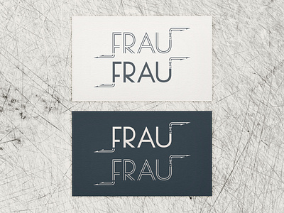
The Frau Line logo incorporated elements influenced by aviation, which was at the heart of this project. The inline, Deco-inspired lettering drawn to compliment the label art, gave the logo a feel of formation flying. The arrows were situated to mimic how pilots whiteboard dogfight scenarios.
